Savills Workplace & Design
Architectural Designers
- Client
- Savills
- Focus
- Art Direction
- Web Design
- Industry
- Architecture
- Date
- 2024
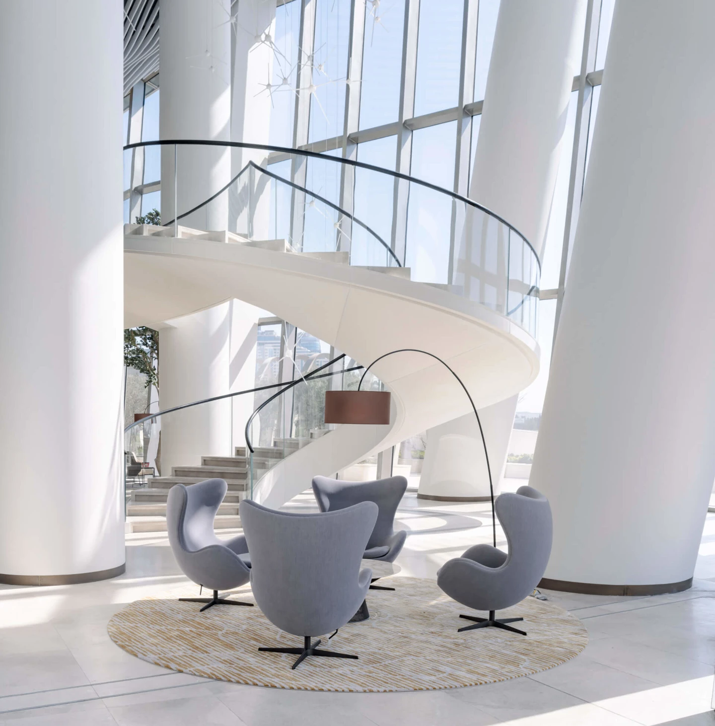
Positioning Savills Workplace & Design as a prominent contender among global architectural leaders online.
Challenge
Savills Workplace & Design, previously known as KKS Savills were looking to improve their digital presence with an overhaul and improved online personality. The aim was to sit among the industries best, providing an online experience that not only communicated their values, personality and passion, but also provided an experience that implied a different way of thinking with something more unique.
The website incorporated elements of Savills branding to remain true to the umbrella brand and provide consistency across multiple platforms.
Solution
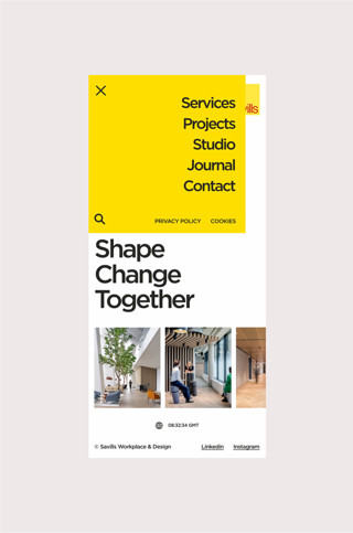
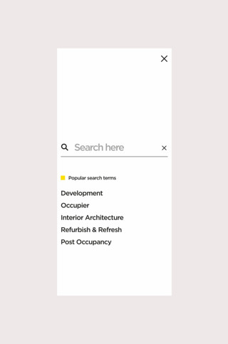
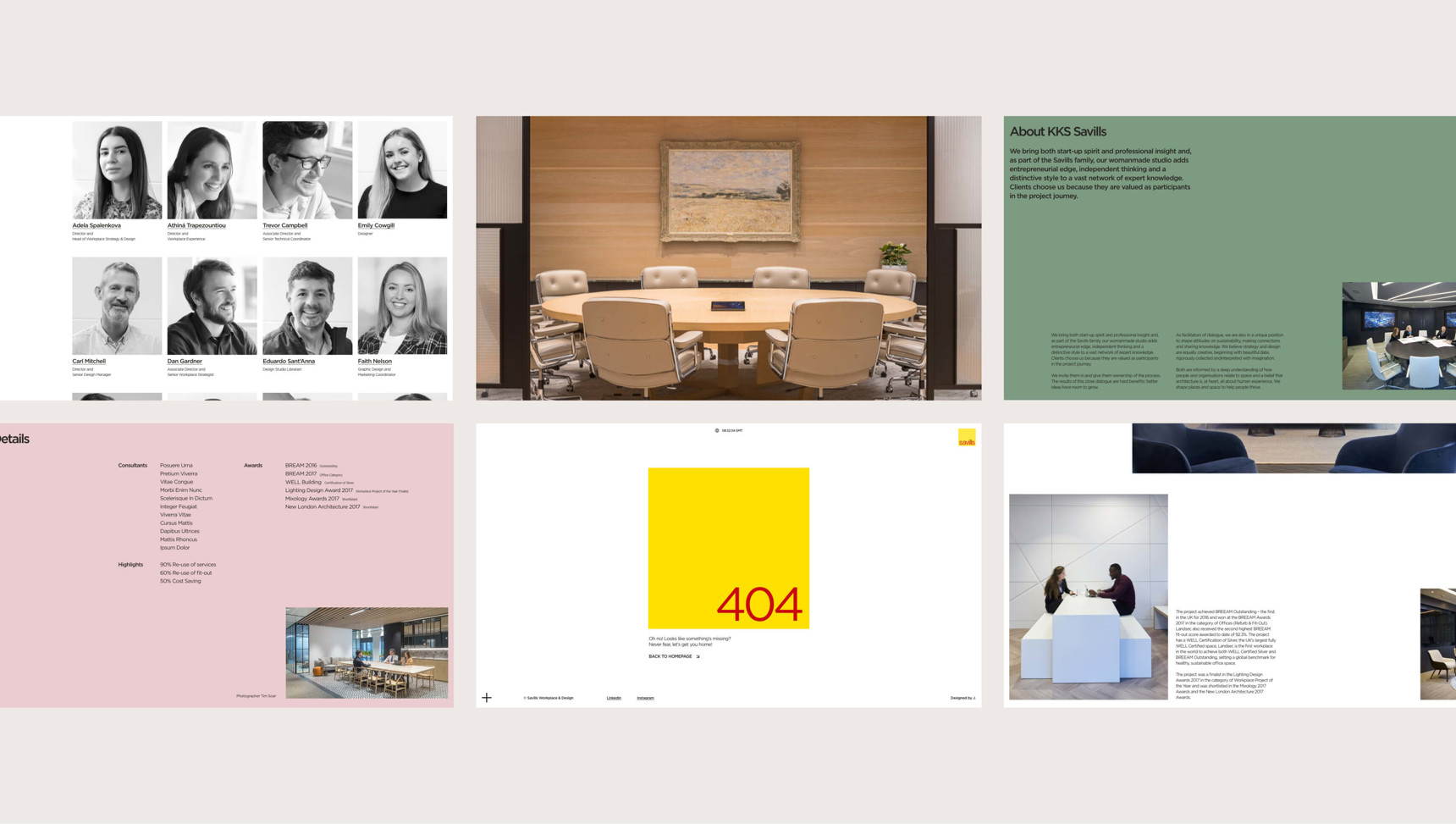
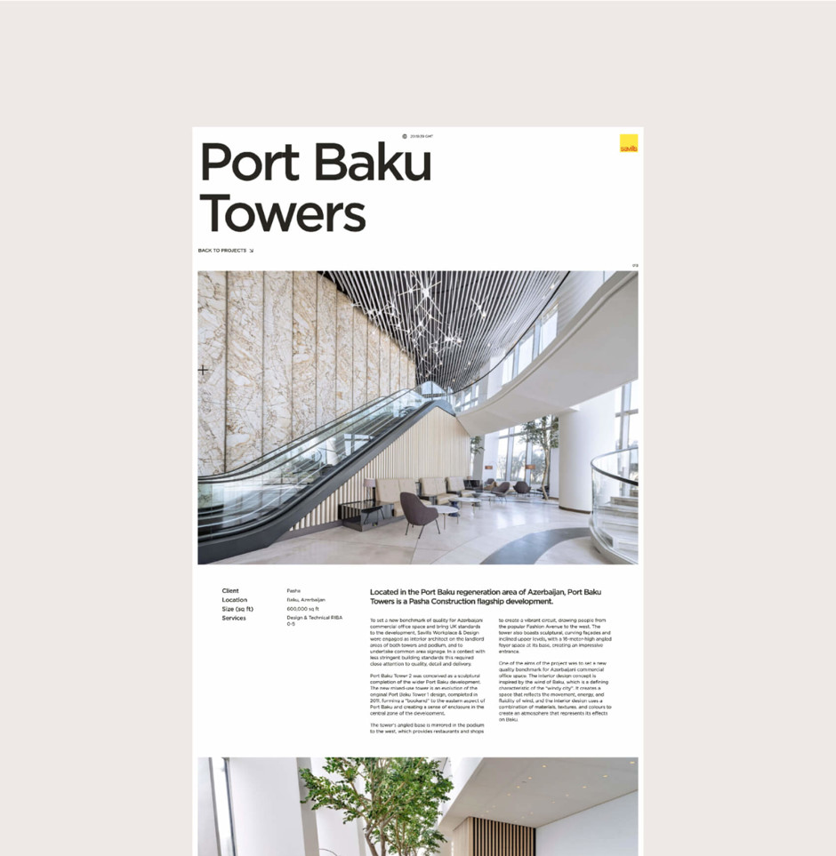
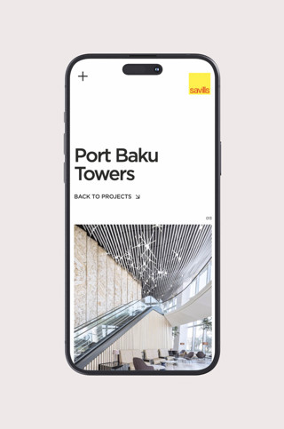
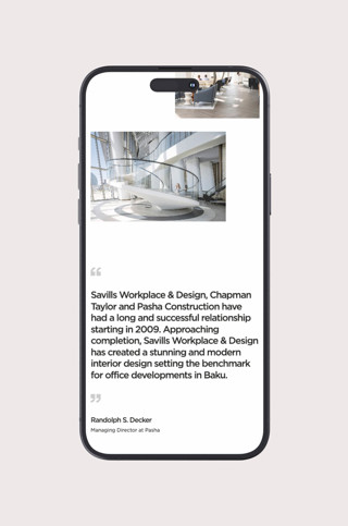
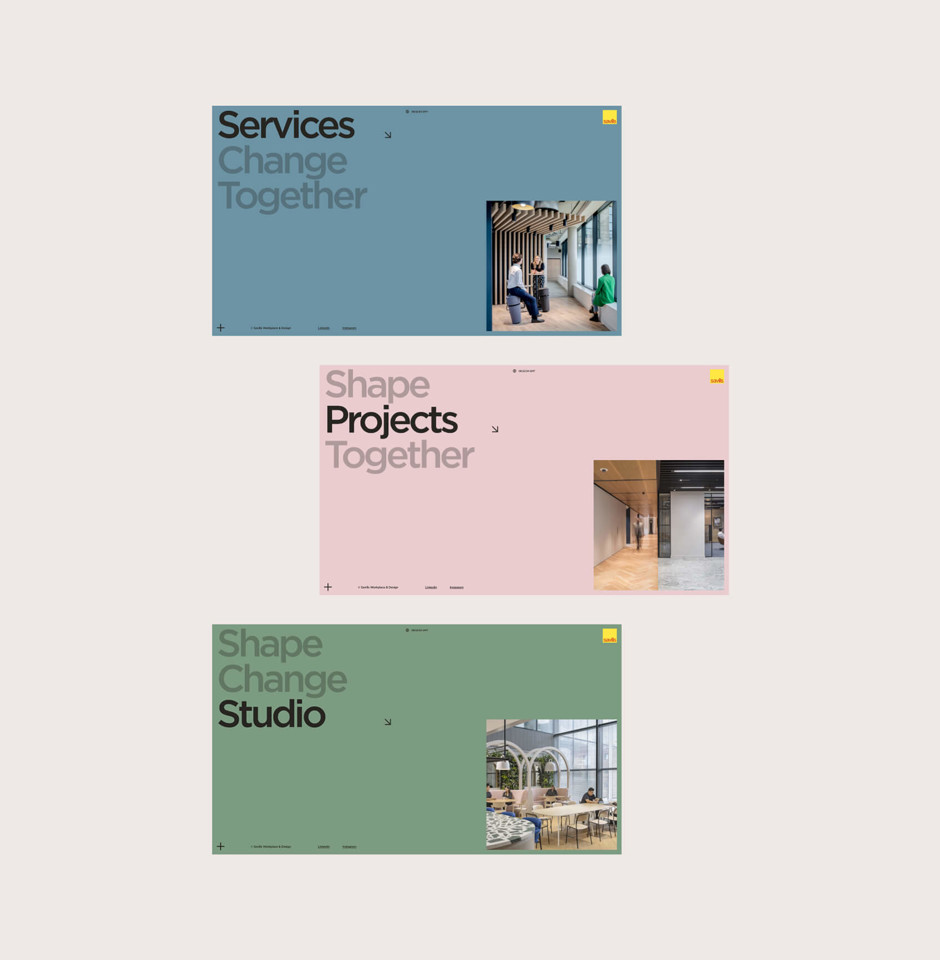
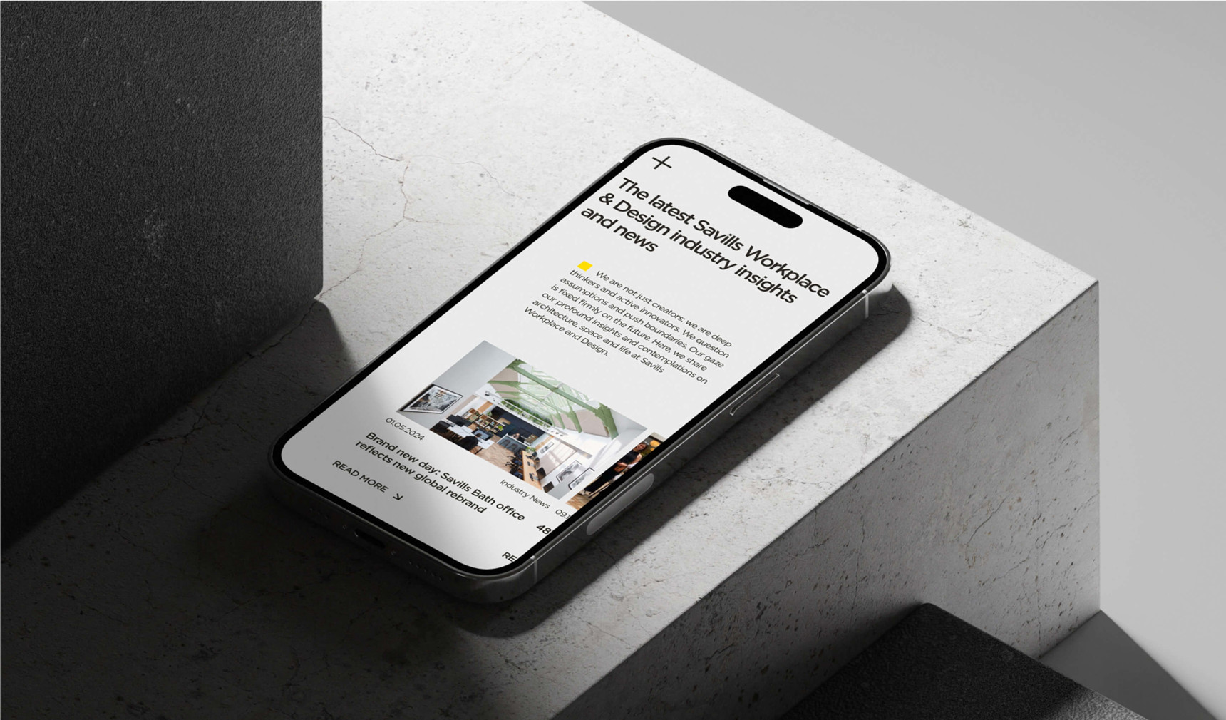
Significantly improving Savills Workspace & Design's online presence, implementing an intuitive interface and enhanced interactivity with projects. This transformation includes the integration of hovers that effectively project the company's ethos and values, alongside a refined application of Savills yellow colour palette to subtly inject the brands visual personality.
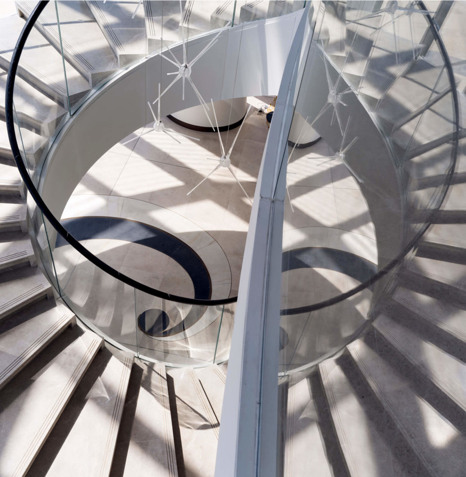
The introduction of interesting elements for toggling views between projects and revamping the 'Meet the Team' section also provides a level of curiosity for users. Furthermore, utilising beautiful imagery in an editorial format for project pages, along with up fades on loading, adds elegance to the visuals, elevating the platform's unique level and contributing to an overall enhanced user experience.



Testimonial
James did an excellent job for us. He was able to capture the spirit of our studio and merge it with our corporate brand to deliver a visually stunning new website.


