Casio
Multinational Electronics Company
- Client
- Casio Computers Co
- Focus
- UI & UX Design
- Web Design
- Industry
- eCommerce
- Date
- 2021

Streamlining Casios online shopping experience with an improved look and focus on customer experience.
Challenge
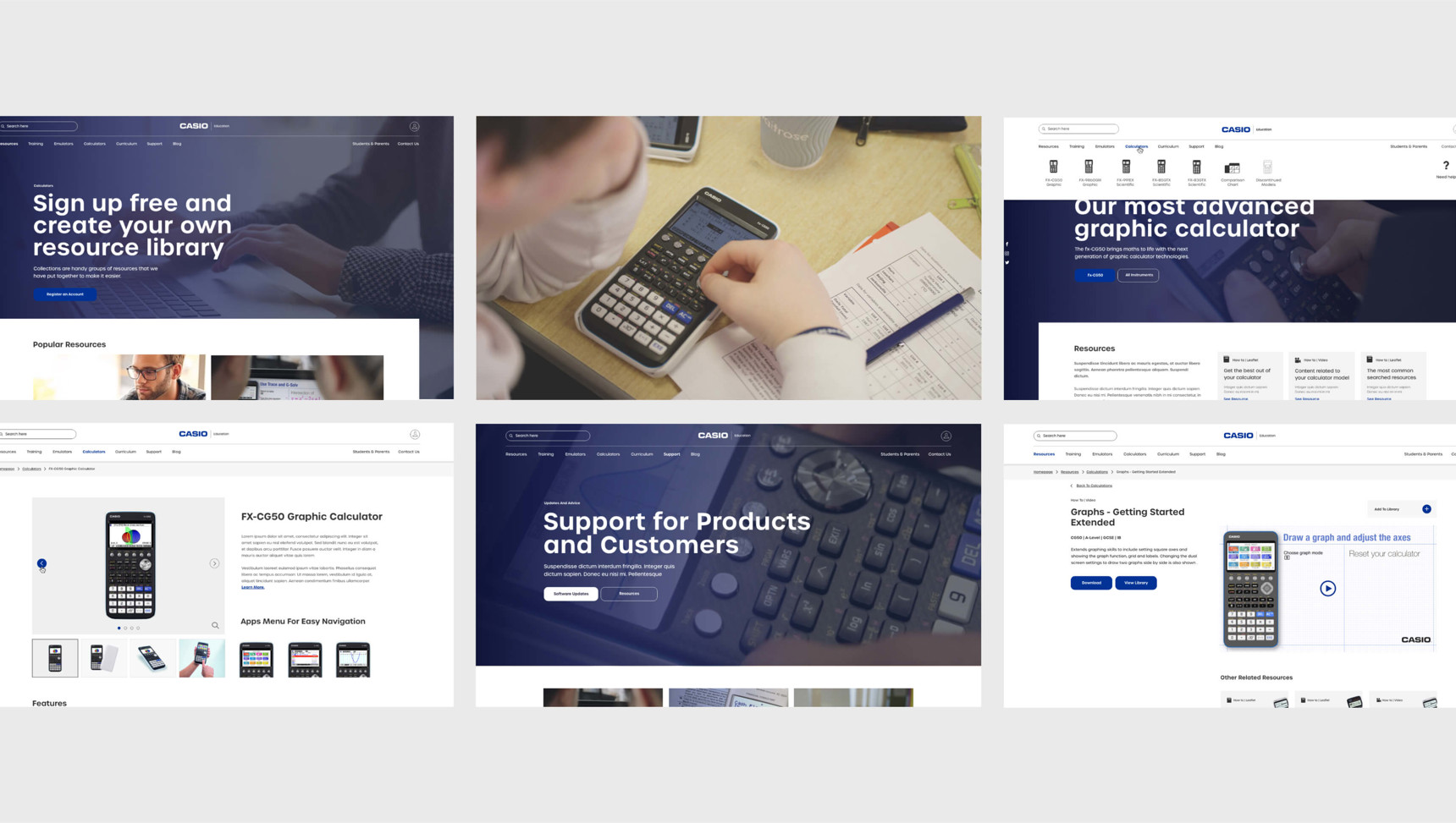
Casio aimed to enhance their online presence by modernising their website to provide an improved shopping experience for both new and existing customers across various product categories, including watches, musical equipment, projectors, and cash registers.
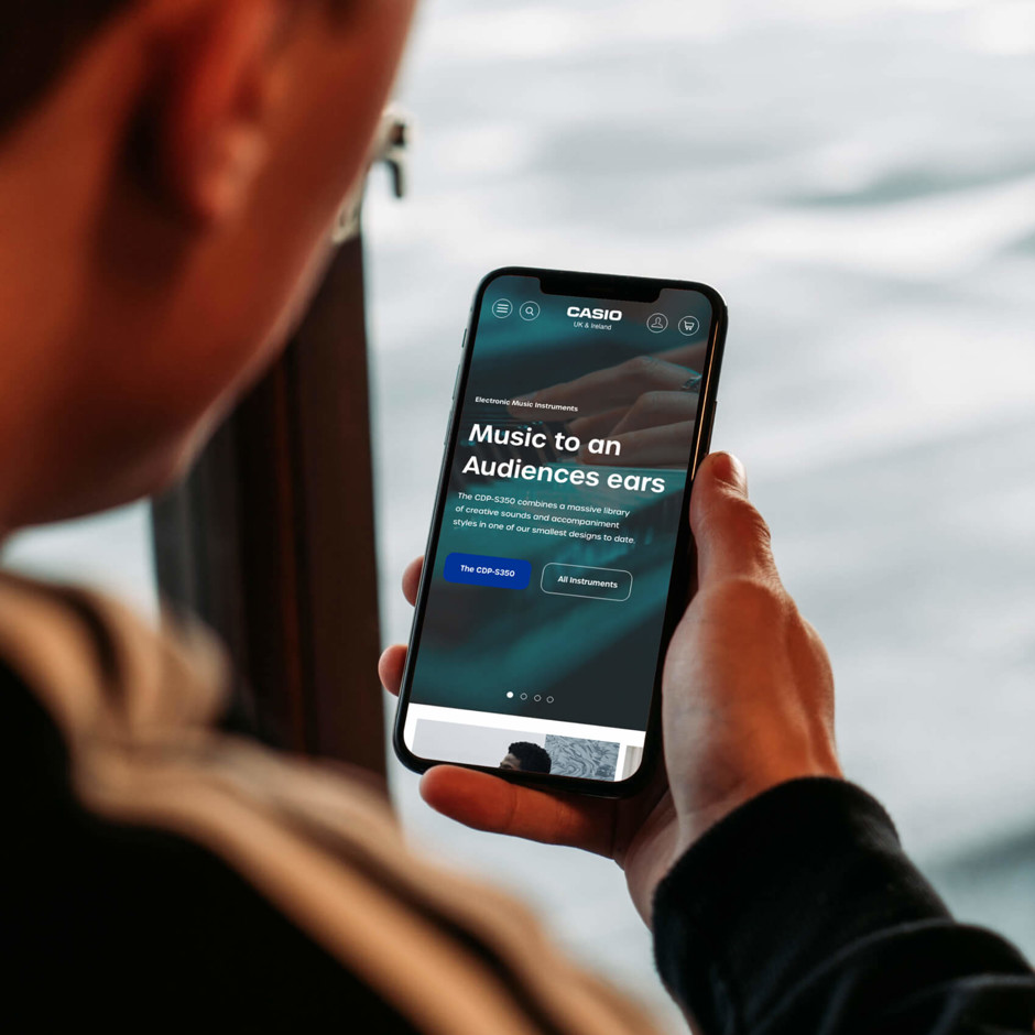
Each category required tailored considerations, with a global focus to improve conversion and A.O.V. Additionally, the brand sought a refreshed look for its website and across multiple social platforms to effectively communicate their brand identity.
Solution
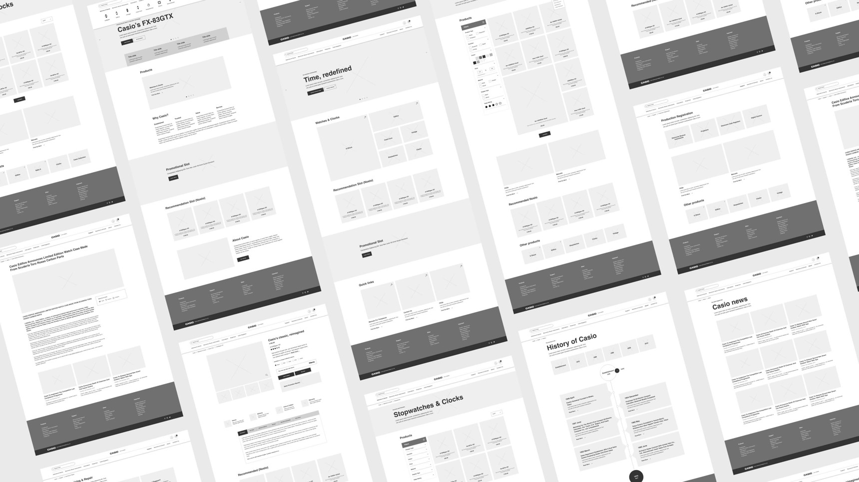
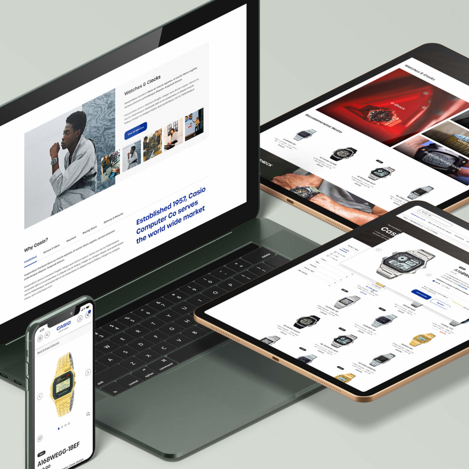
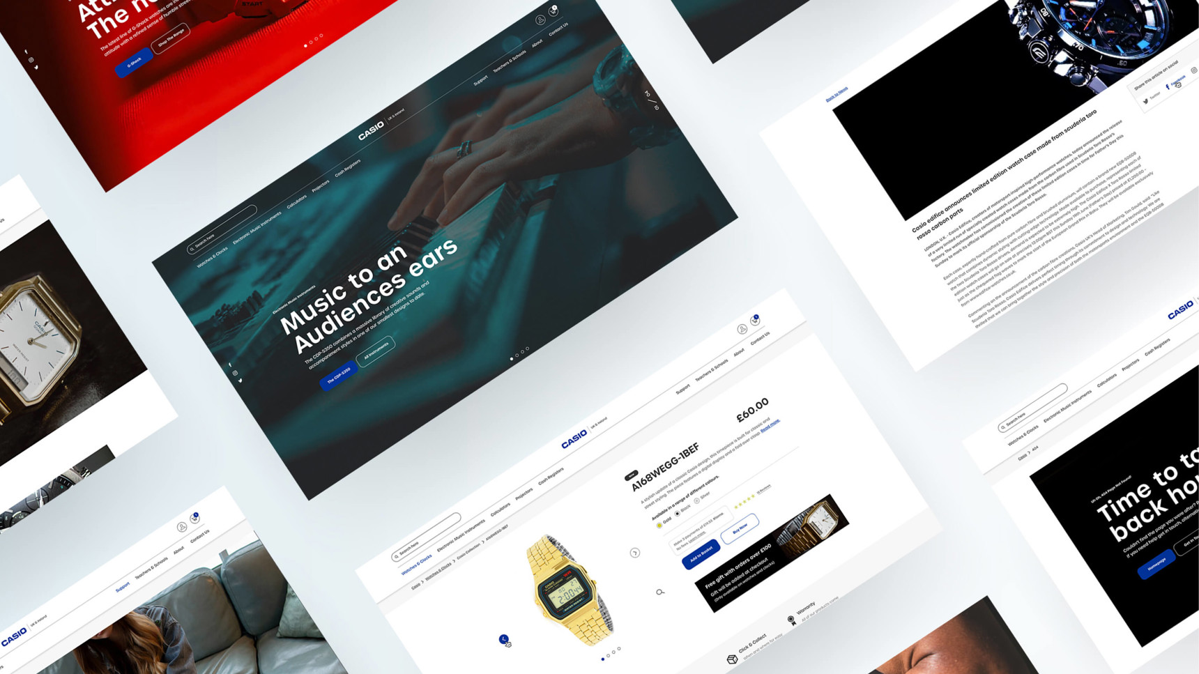
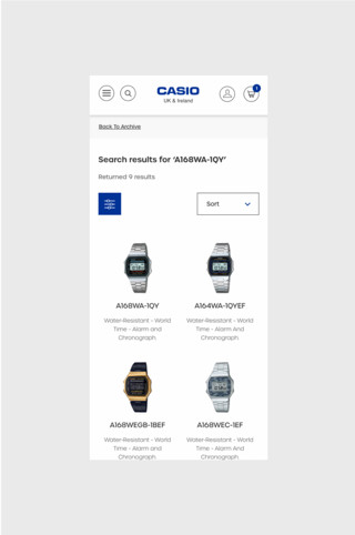
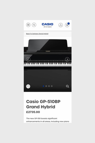
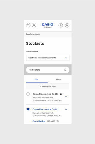
Over 71 pages were designed for Casio's main website, addressing the needs of customers, stockists, and those seeking detailed product information. Each page accounted for multiple user scenarios, stages, and forms, and was created as a high-fidelity wireframe before being tested for streamlined user journeys. These journeys included making purchases, contacting support, creating accounts, booking services, and tracking repairs. Additionally, third-party plugins such as HubSpot and HubBox were integrated.
Key elements of the redesign included ease of navigation, restructuring the sitemap, and incorporating responsive modular components to construct custom pages. This comprehensive approach revitalized the brand's online presence.
Global Success
Other key elements within this process included ease of navigation, restructing of the sitemap and responsive modular components (to construct custom pages) to bring the brand back to life. Staying true to their branding and ethos, a new website which focuses on user ability and products, whilst ensuring future flexibility.
This has helped to drive more revenue online than its previous online presence and now appeals to a modern audience. The wireframes took over 6 months and were signed off by Casio’s head office in Japan. The head office were so pleased with the final designs and outcome that it was rolled out globally across all international casio sites.
Brand Evolution
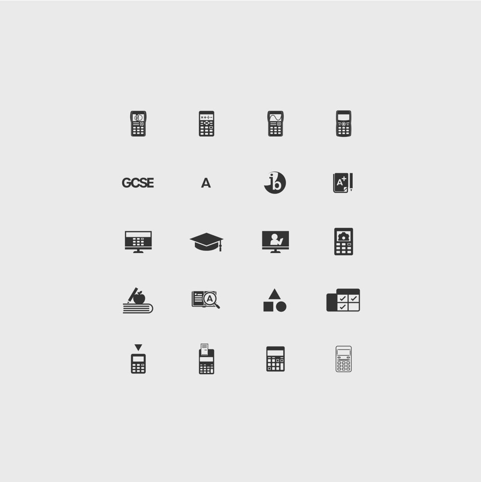
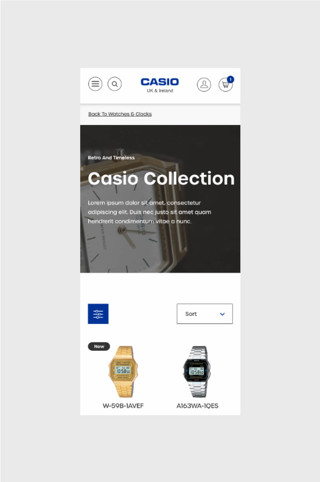
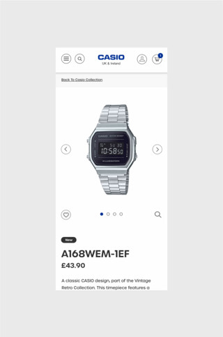
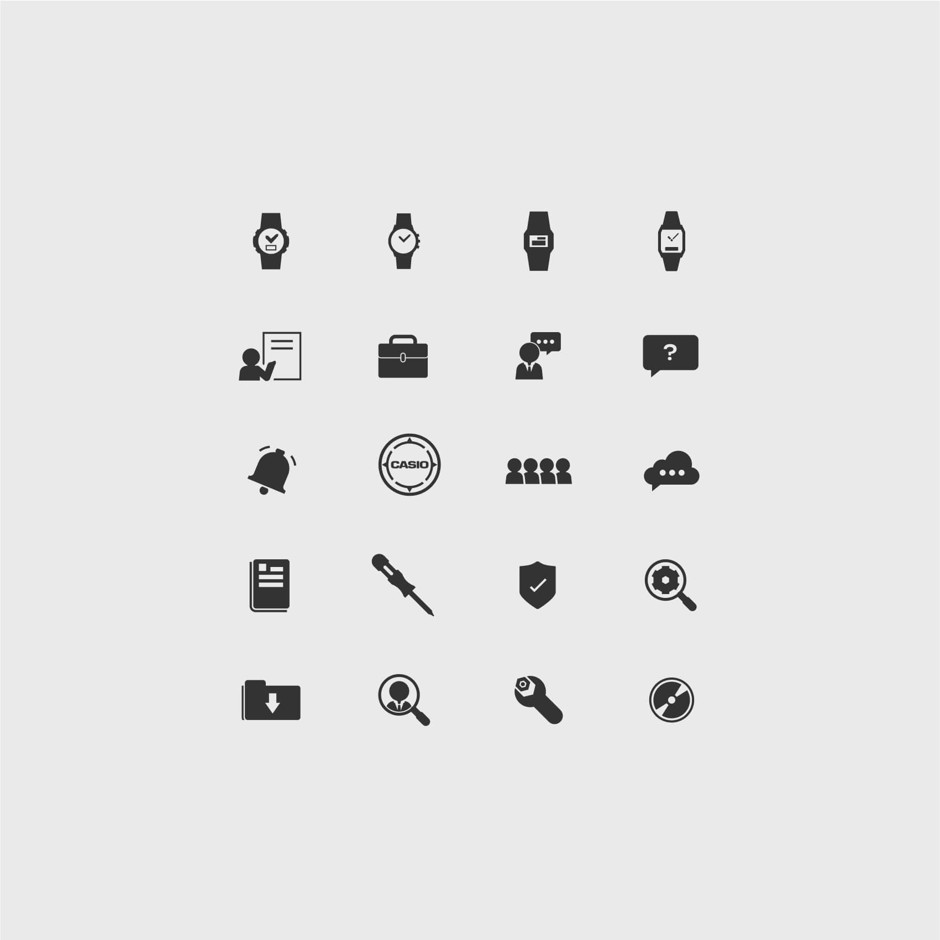
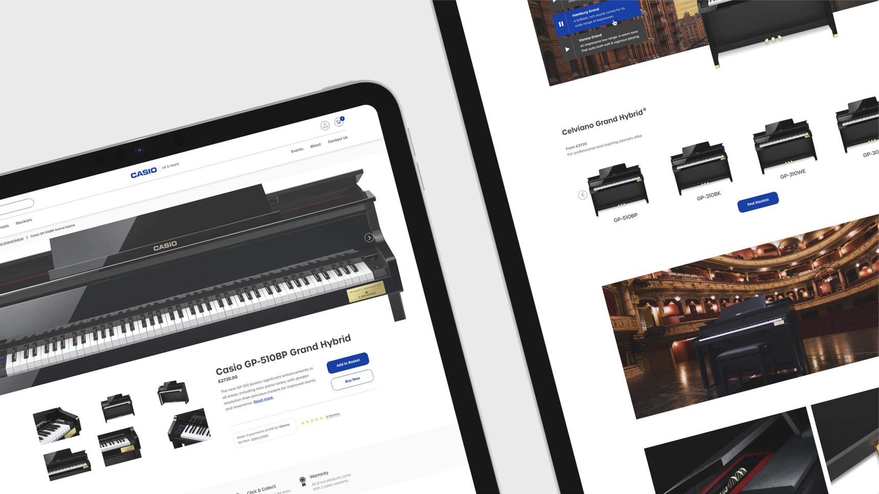
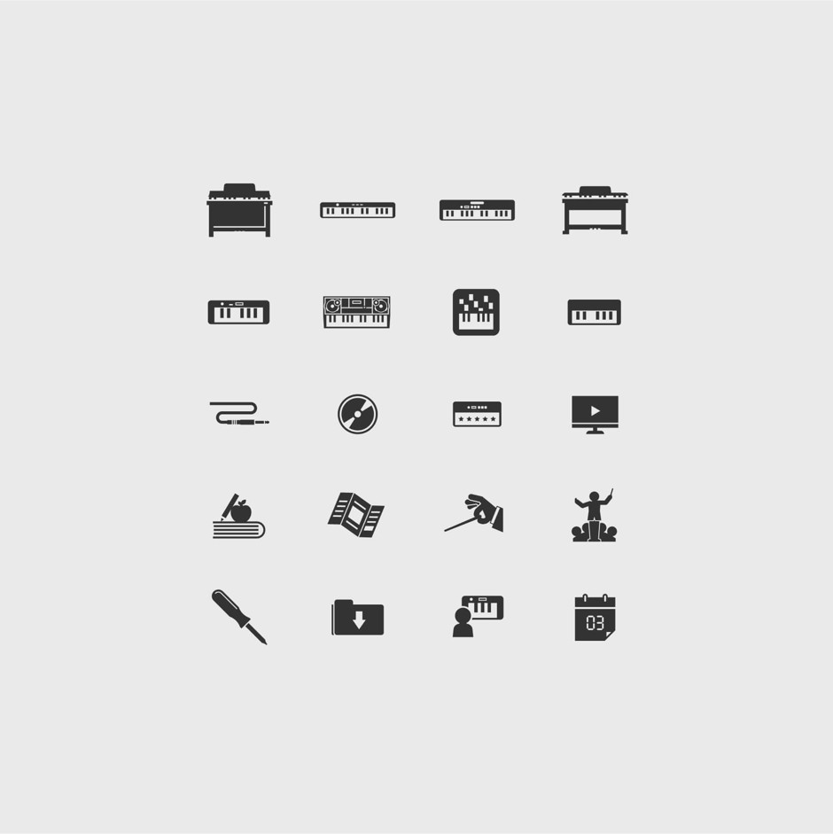
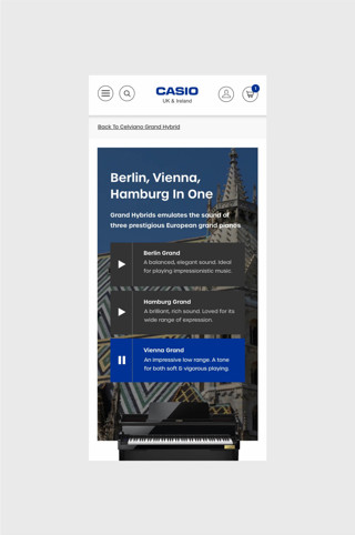
The modular design approach allowed different sections of the website to work independently, creating a consistent yet unique experience within each product area. Including a range of iconography for each sector to help adopt a visual language and highlight items through the use of semiotics. The designs were so well received in Japan that it was rolled out globally across all language sites. The wire frames and research considerations led to improved user sessions, increased browsing time, and reduced bounce rates.
Each area of the website has continued to excel in customer engagement, and as different departments evolve the unique offerings of Casio, the website continues to develop and grow while maintaining brand consistency online.
